· 3 min read · by Megha Chaudhary
The Design Problem With Vibe Coding
the AI website design workflow i landed on after way too many iterations
okay so i’ve been experimenting a lot with Claude Code for design, and somewhere along the way i finally landed on a workflow that actually works for me.
not just something that looks decent on the first try.
a process that consistently gets me somewhere good.
lately i keep seeing the same thing everywhere: people are building genuinely good products, then wrapping them in painfully generic vibe-coded websites.
so i’m writing this slightly out of frustration.
1. stop asking AI to “make it look good”
Claude does not magically have your taste.
if you say:
make this modern, minimal and premiumyou’ve basically told it nothing.
before i design anything, i collect around 10–15 references.
not necessarily full websites. maybe i like the typography from one, the colors from another, a tiny interaction somewhere else.
the goal isn’t to ask AI to invent your taste.
show it your taste.
2. explain why you saved each reference
screenshots alone are surprisingly ambiguous.
maybe i saved something because i liked the colors, but Claude thinks i liked the image there.
so annotate everything.
circle things. crop things. draw arrows.
a screenshot says “look at this.”
an annotation says “look at THIS.”
3. this is why i built Moodbit
my old workflow was basically 50+ browser tabs, screenshots everywhere and me trying to explain to Claude which tiny detail i liked from which image.
that eventually became Moodbit.
i can save references while browsing, crop and annotate the exact parts i care about, then point at an element in my own app and send that visual context to Claude.
instead of:
make this cleaneryou can communicate:
make this section behave more like this reference, keep our typography, and use this spacing.visual context beats adjective soup.
4. define the visual world first
you shouldn't ask Claude to immediately build the entire webpage.
first decide the basics:
typography, colors.... basic design system, nothing too fancy.
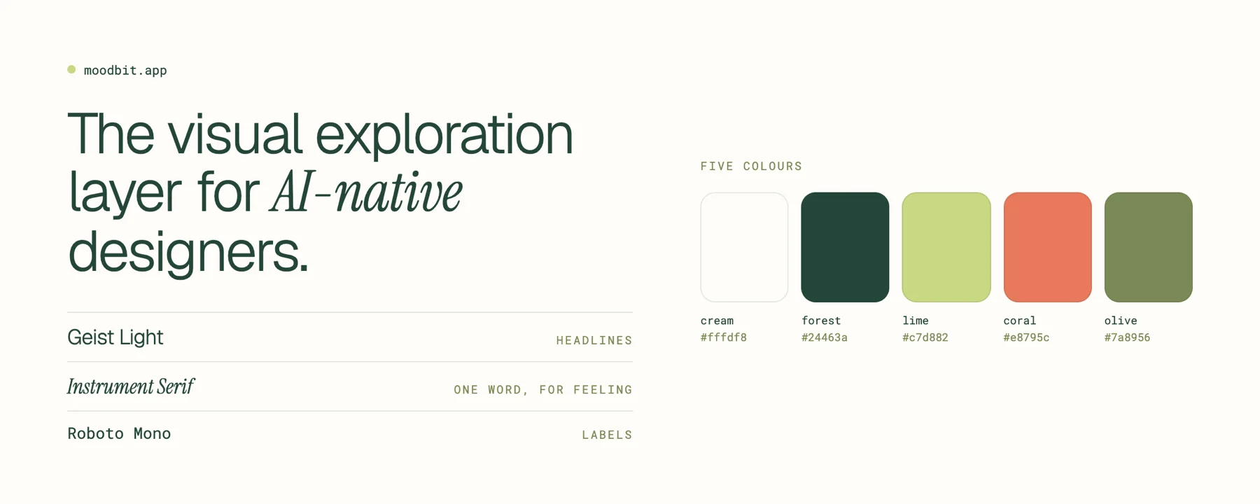
you don’t need a huge design system.
just enough rules that Claude doesn’t invent a new personality every section.
5. explore multiple directions
once the visual language is clear, i usually generate 4–5 genuinely different layouts.
not the same hero moved slightly to the left.
actually different.
AI makes exploration cheap.
use that.
maybe mockup #2 has the best hero and #4 has the best navigation.
take the good bits.
kill the rest.
6. don’t stop at 80%
if something is mostly good, don’t regenerate the whole thing.
figure out what’s still wrong.
- the heading is too large.
- the spacing feels cramped.
- the cards are too symmetrical.
- the CTA feels disconnected.
then fix those things.
this is where most vibe-coded websites fall apart. they get to “pretty good” and stop.
but the difference between something that feels AI-generated and something that feels actually polished is usually hundreds of tiny decisions.
so keep going until there’s nothing obvious left bothering you.
7. fix the copy too
bad AI websites don’t just look AI-generated.
they sound AI-generated.
revolutionize your workflowunlock the power of AI seamlesslysupercharge your productivity
please stop.
cut the filler.
make the headline say something.
delete sections that don’t need to exist.
good visual design can’t fully rescue meaningless copy.
8. motion comes last
do not use animation to resuscitate a bad layout.
get the static page working first.
then add hover states, transitions, reveals and microinteractions.
and use references here too.
“add a cool animation” is vague.
“make this behave like this” is useful.
9. iterate more than feels reasonable
sometimes i go through multiple iterations across layouts, components and tiny experiments.
and honestly, AI should make us explore more, not less.
execution got cheaper.
so try the weird version.
delete half the page.
break the grid.
make one thing enormous.
see what survives.
people ask whether AI can make good websites.
i think that’s the wrong question.
AI mirrors you.
give it vague prompts and accept the first output, and you’ll probably get generic AI design.
give it references, constraints, judgement and lots of iteration, and the output changes completely.
the model didn’t suddenly develop taste.
you gave it yours.
And please, put in the effort.
If something was made in five minutes, it usually looks like it was made in five minutes. AI can make execution faster, but that doesn’t mean the thinking should disappear with it.
Use AI as a tool, not your replacement. Spend time with your projects. Care about the tiny things. Be annoyingly particular. Keep changing things until they actually feel right.
In my experience, the more I care about a project, the better the design gets :)