Wetering.
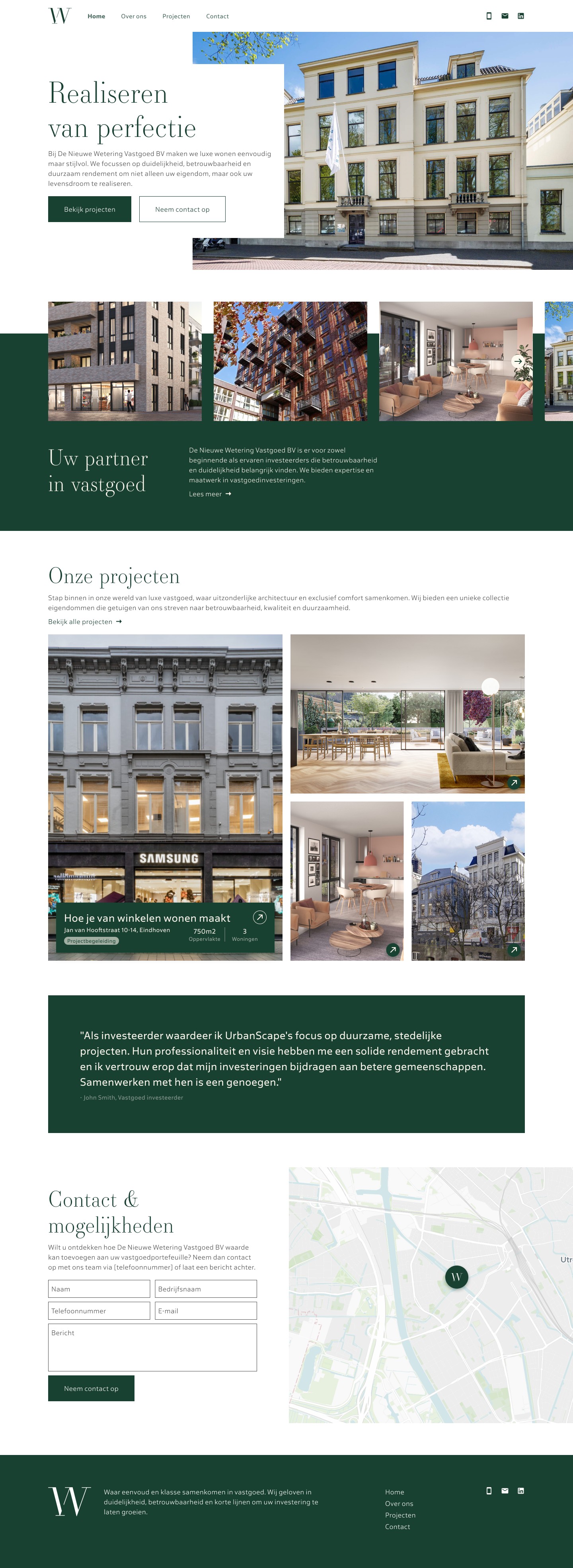
A design agency brought me in to design the website for Wetering, a property management company: a quiet, premium brand in deep green and warm cream.
01
The brief
The agency's client manages properties, and the direction was to feel closer to a hospitality brand than a listings portal. The design leans on two colours, deep green and warm cream, a serif for headlines, and photography given room to breathe. Most of the site's composure comes from what is left out: no carousels, no badges, no competing calls to action. Trust is the product being sold, and the layout's job is to look like it has nothing to prove.
02
About and projects
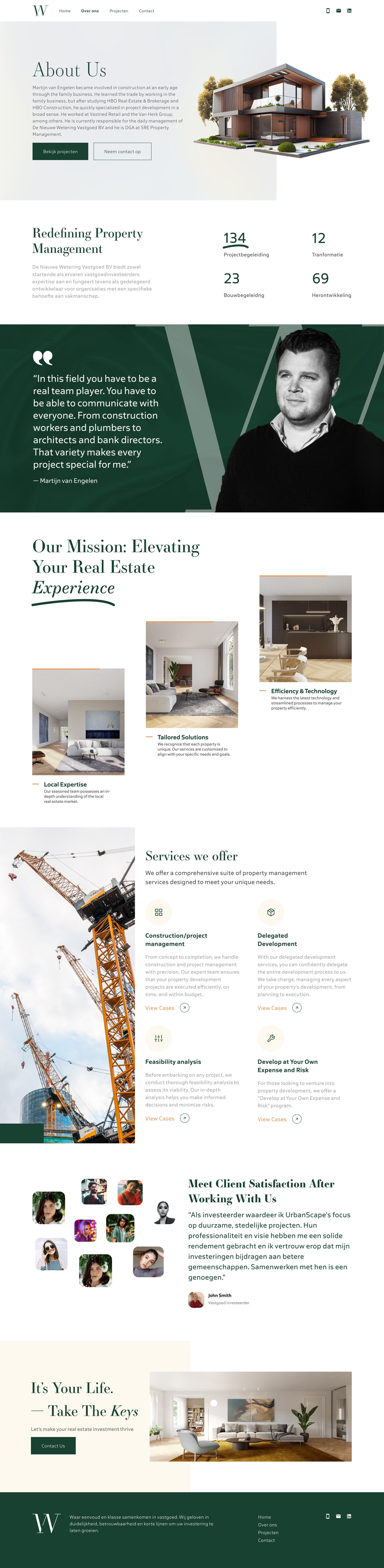
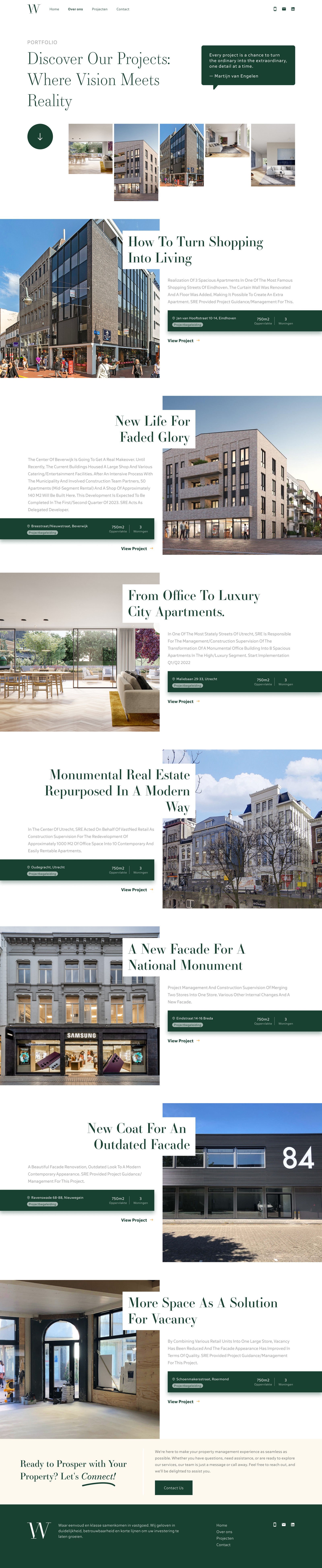
Interior pages follow the same grid and type scale as the home page, so the site reads as one continuous piece. The about page leads with the people; the projects page lets the properties carry the weight.
About
Projects
03
Contact and mobile
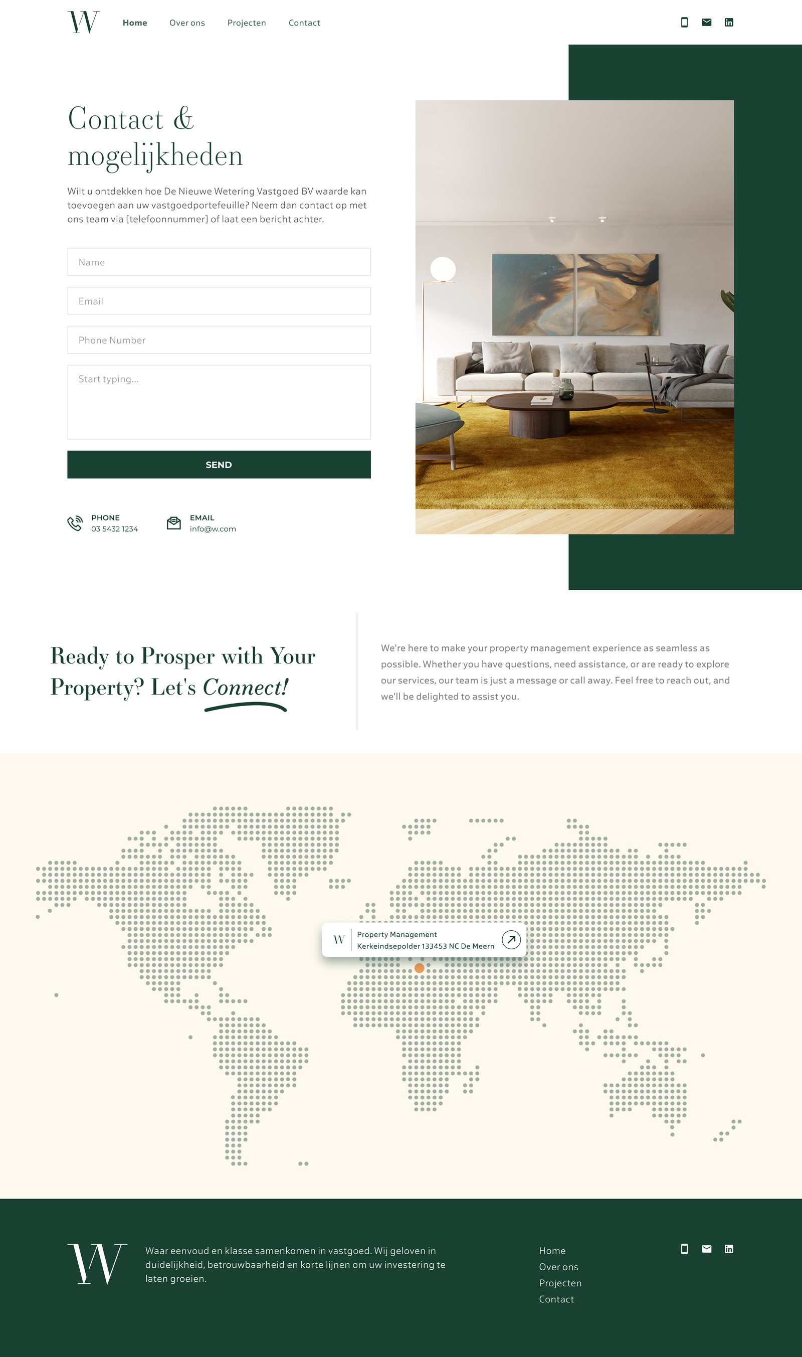
The contact page keeps the form short and the next step obvious. On mobile the layout collapses to a single column, and the type scale steps down without losing the serif's presence.
Contact
Mobile
