Miracly.
A tool that gives a business a page for every question its customers ask Google and AI.
01
The home page
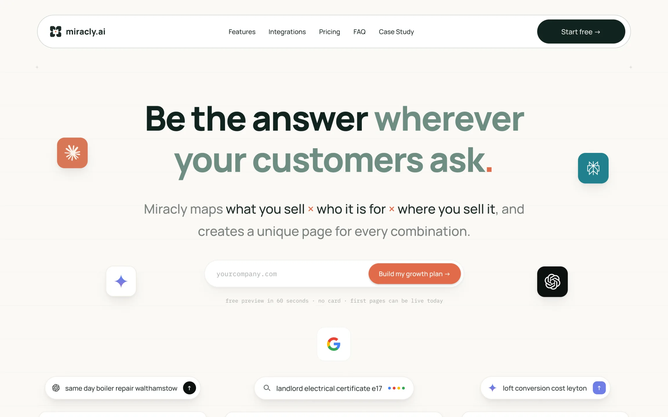
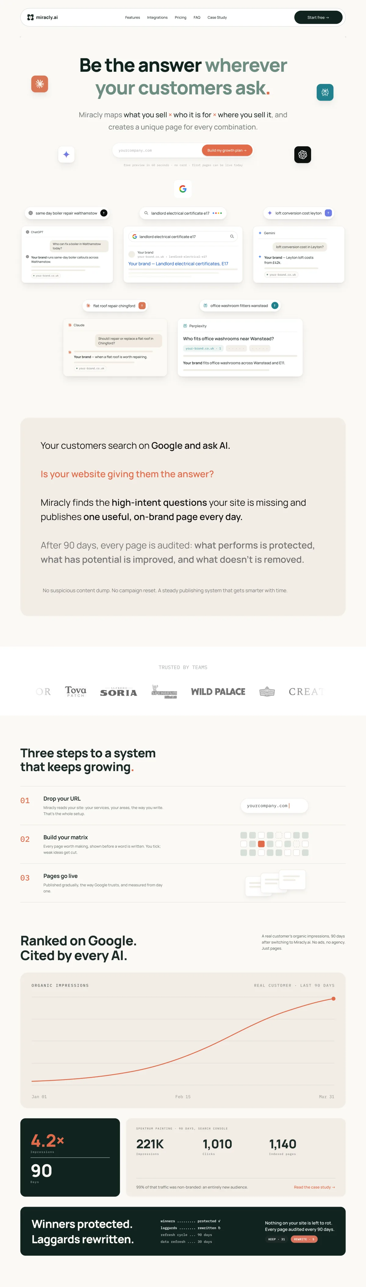
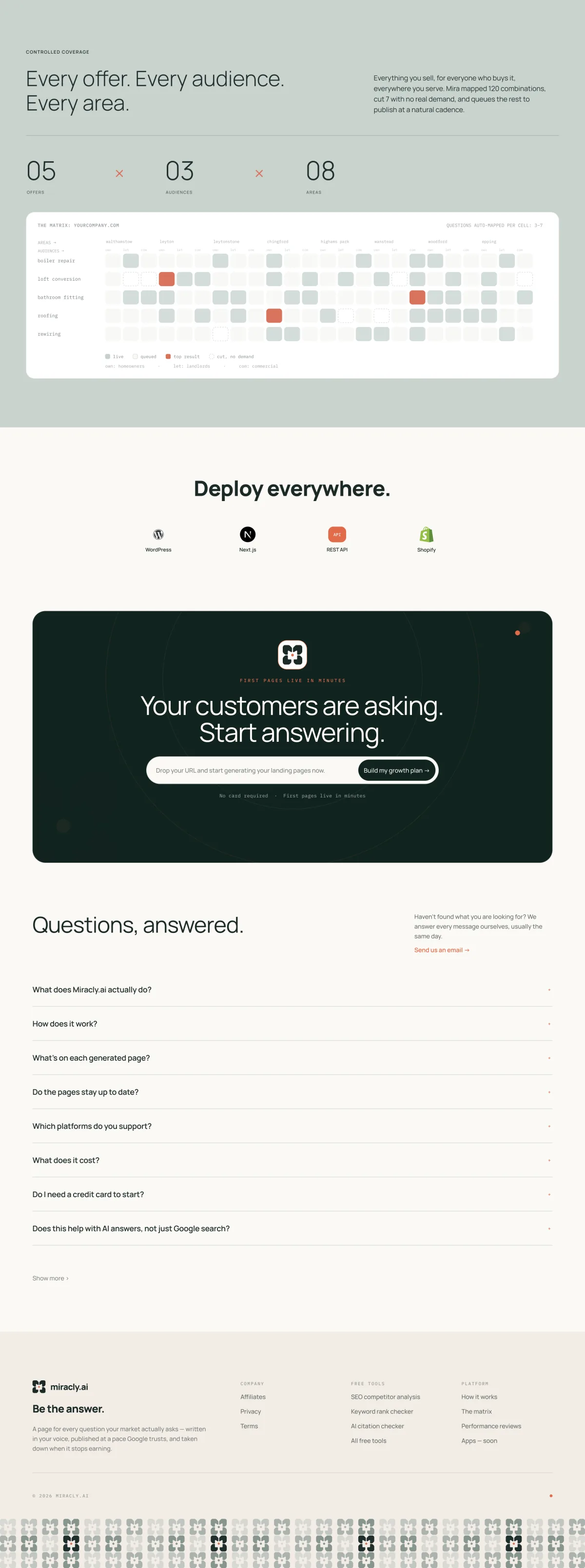
I designed the home page to show the product working instead of describing it. It opens on the kind of questions people type into Google, ChatGPT, Gemini and Perplexity, each one answered by a Miracly page. Then the three steps, the results, and the matrix of offers, audiences and areas that decides which pages get written.
02
Brand direction
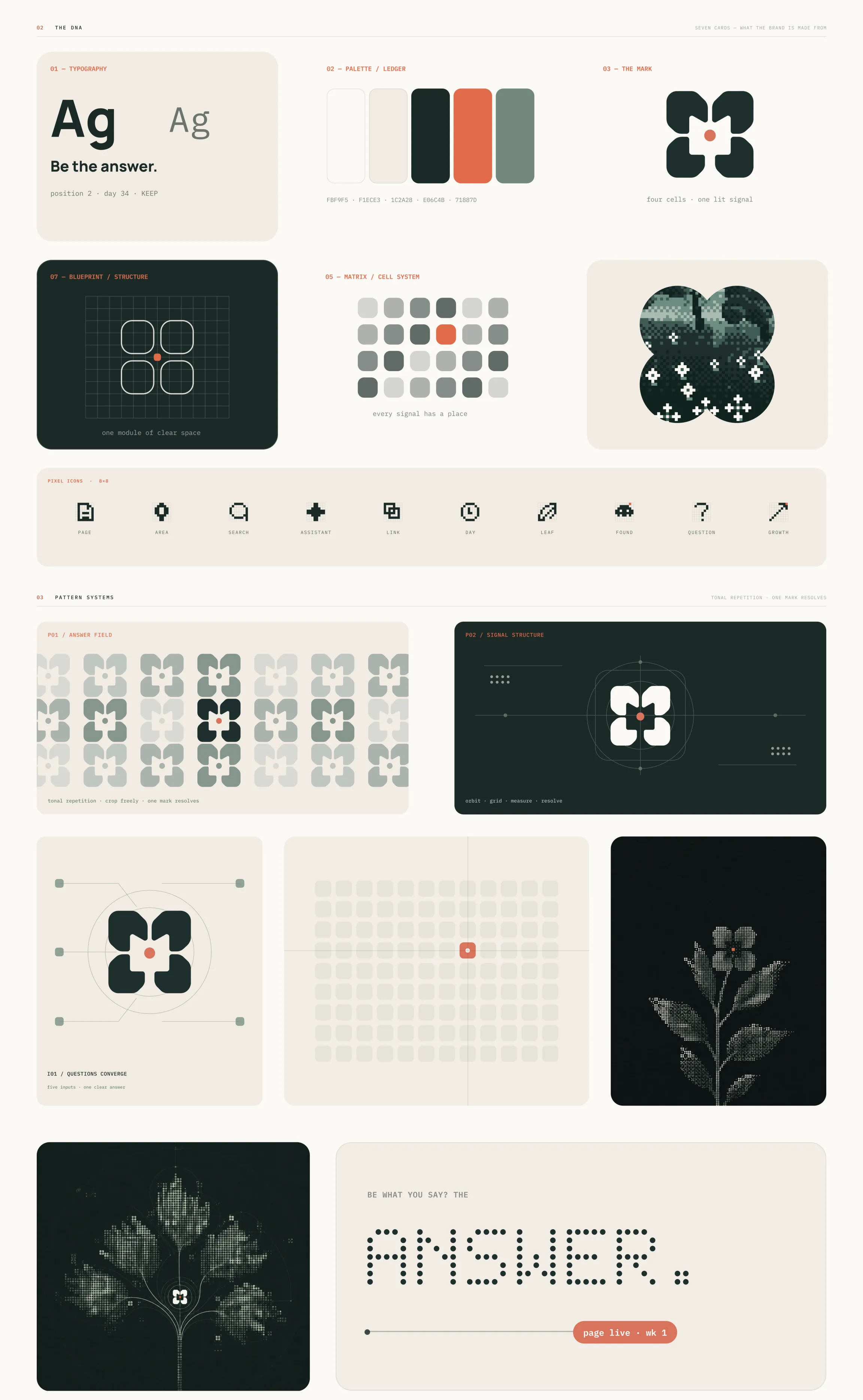
Everything in the brand comes from one picture: a grid of cells with one of them lit. It is the product in miniature, a matrix of possible pages and the one that answers the question. The same idea runs through the mark, the matrix, a set of 8x8 pixel icons and the patterns, where one mark resolves out of many.
03
The mark
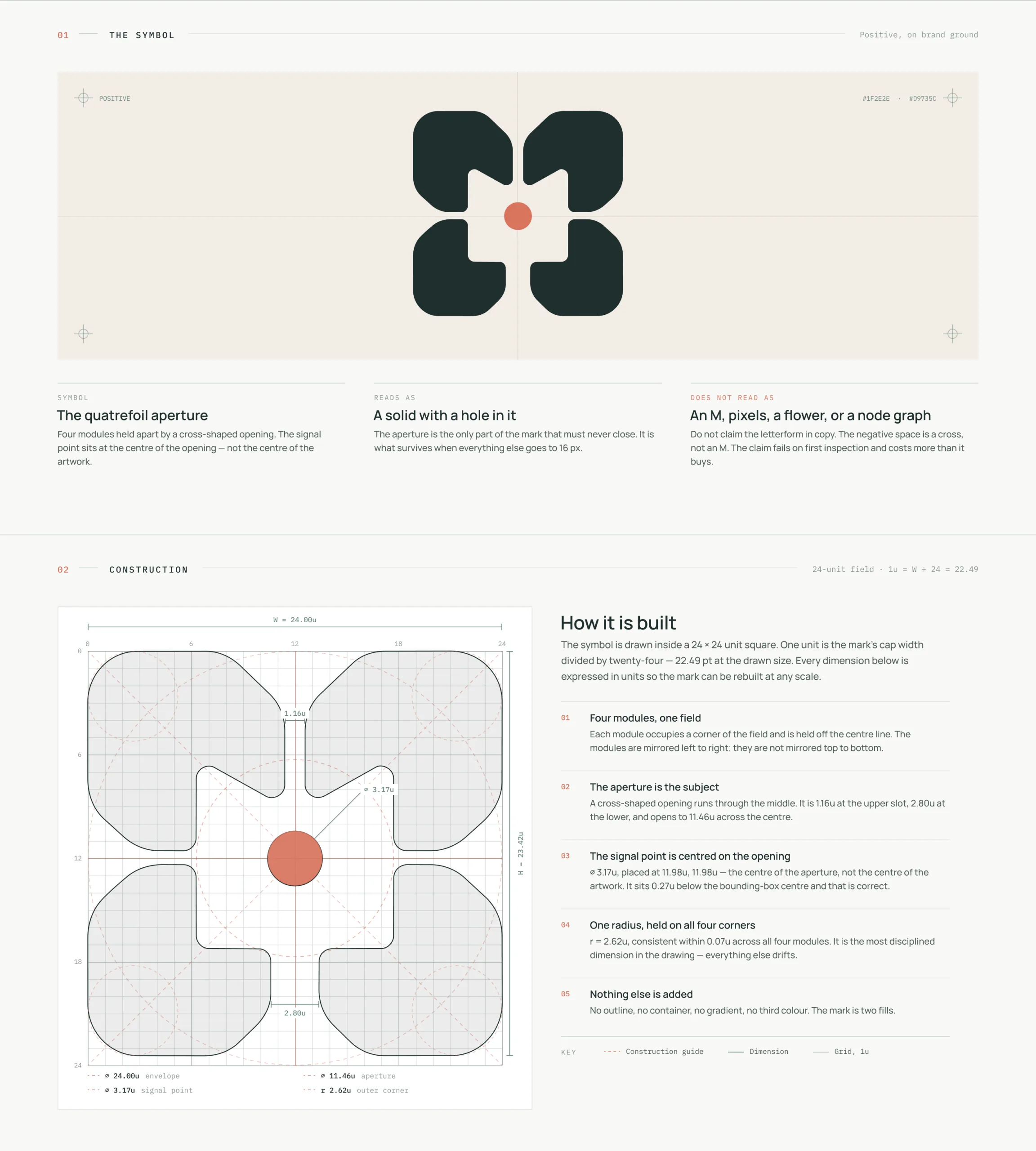
Four modules held apart by a cross-shaped opening, with a coral signal point at its centre. I drew it on a 24-unit grid with one corner radius on all four modules, so it can be rebuilt at any size. It should read as a solid with a hole in it, not as an M or a flower.
04
Lockups and colourways
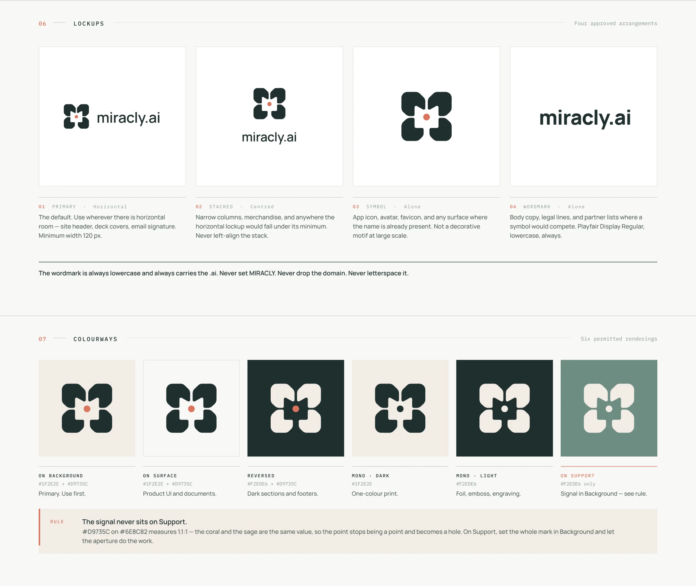
Four lockups and six colourways, each with the job it is for. One rule matters most: the coral point never sits on sage. The two share a value, so the point would read as a hole. On sage the whole mark goes light and the opening does the work.
05
Colour and type
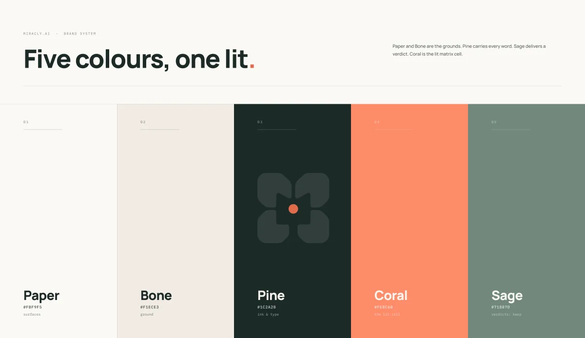
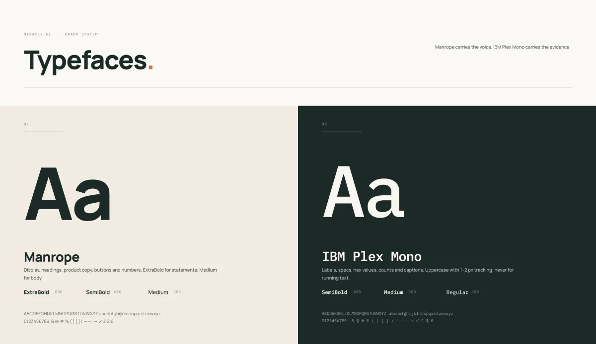
Five colours, one lit. Paper and Bone are the grounds, Pine carries every word, Sage marks a verdict, and Coral is only ever the lit cell. Manrope carries the voice and IBM Plex Mono carries the evidence: labels, counts and specs.
06
Key visuals
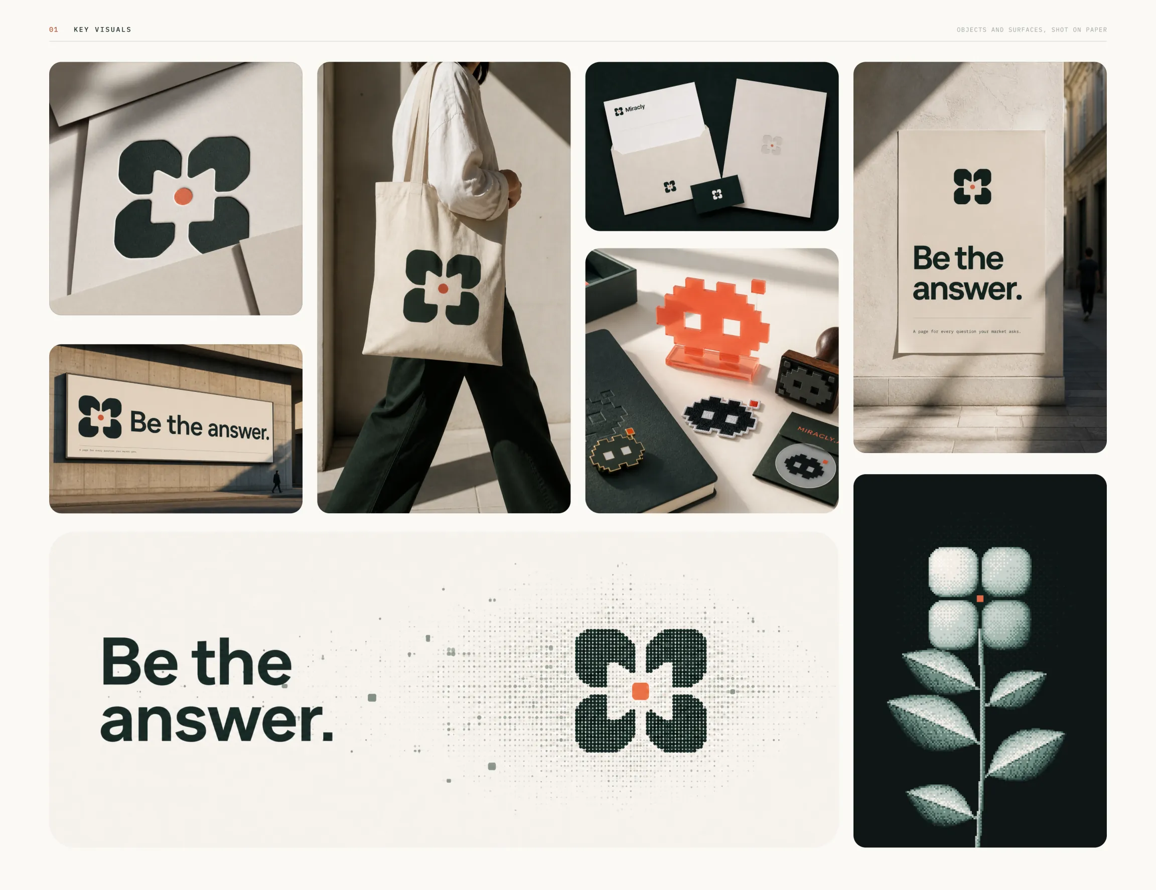
The line the brand is built on, be the answer, set on posters, stationery, a tote and a billboard, with the pixel mascot as a stamp, a patch and an acrylic figure.